Summarize the Content of the Blog


Why most glass tables get abandoned
The pattern is consistent across Splunk ITSI deployments. The glass table looks impressive in the implementation demo. It contains thirty KPIs, six service health rollups, a real-time event feed, and a heat map of the entire environment. Three weeks after go-live, nobody opens it.
The root cause is design intent confusion. A glass table that tries to show the entire IT environment becomes the dashboard equivalent of a Wikipedia page: comprehensive, technically accurate, and useless for decision-making. An executive opening the glass table on Tuesday morning asks a specific question (“is order processing healthy this morning”). The thirty-KPI glass table does not answer that question in under 5 seconds. The executive closes the tab and checks the metric another way.
The fix is intent. Each glass table should answer one specific operational question for a specific operational audience on a defined cadence. The Splunk ITSI documentation describes glass tables as the analyst-facing layer of the platform, but the documentation rarely emphasizes the editorial work that makes that layer actually used.
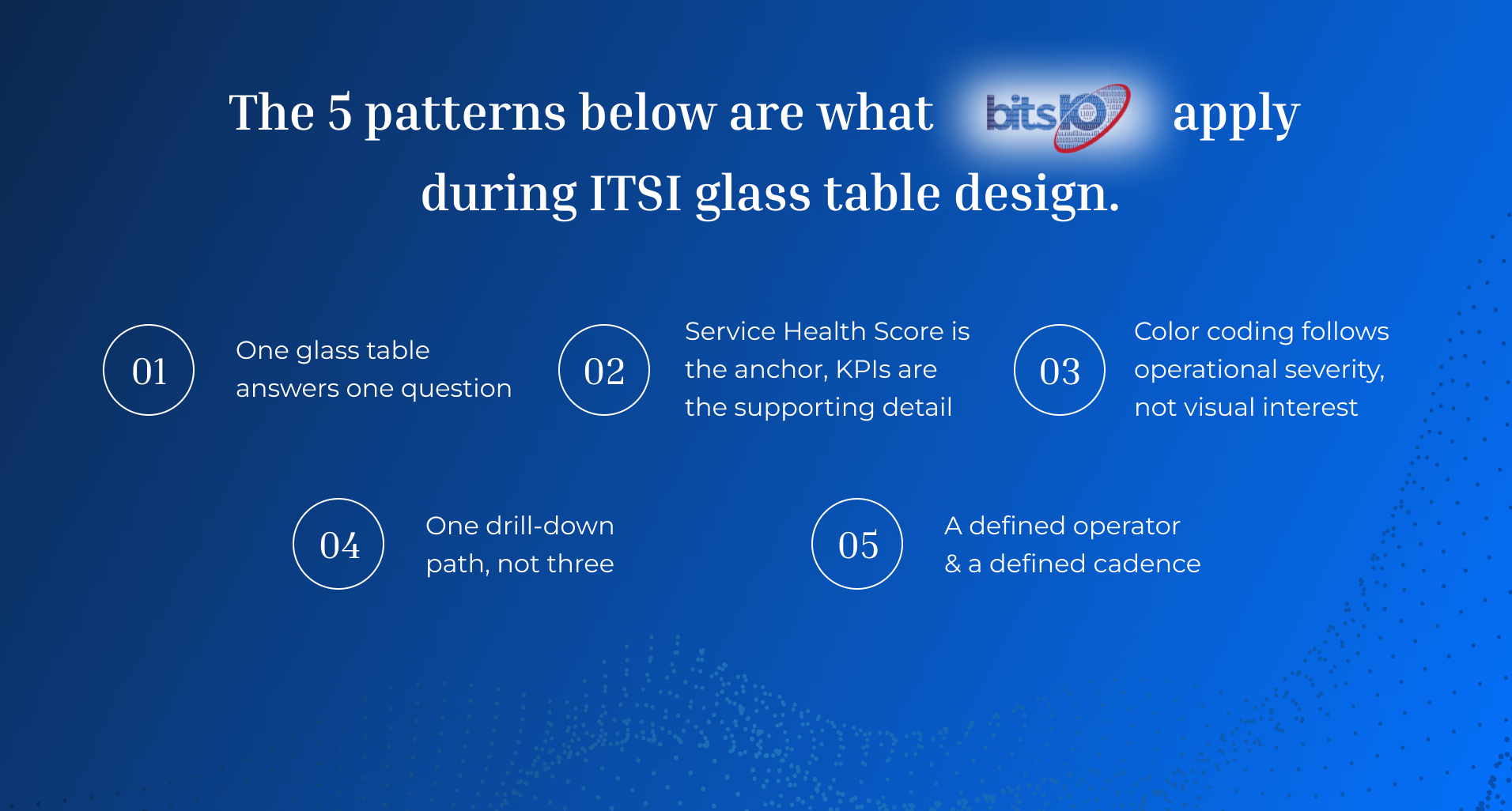
The five patterns below are what bitsIO consultants apply during ITSI glass table design across the complete Splunk ITSI implementation.
Pattern 1: One glass table answers one question
The first pattern is the most important. Before designing a glass table, write down the specific question it should answer.
Examples of good glass table questions: - “Is the customer-facing order processing service healthy right now?” - “Are the three critical clinical applications (Epic, lab system, imaging) meeting their SLA this week?” - “What is the trailing 14-day service-health trend across our top 10 services?” - “Which services are currently in active episodes, and what are the next actions?”
Examples of bad glass table questions: - “What is happening in our IT environment?” - “Show me everything about the customer portal.” - “Display all KPIs across all services.”
The good questions have specific operational answers and clear cadence (now, this morning, this week, this month). The bad questions have no defined boundary and no clear answer.
For each glass table, write the question at the top of the table itself. It becomes the table’s defining feature and the litmus test for every visual element (“does this element help answer the question, or is it decoration”).
Pattern 2: Service Health Score is the anchor, KPIs are the supporting detail
The Service Health Score is ITSI’s calculated 0-to-100 rollup of KPI health per service. It is the single most useful number on a glass table because it integrates many KPIs into one signal that operators learn to trust.
A well-designed glass table makes Service Health Score the visual anchor. Position it prominently (top center or top left). Color-code it by severity. Show it large enough to read at 3 meters distance (someone walking past a NOC screen should be able to see service health without leaning in).
Supporting KPIs appear below the Service Health Score, contextually grouped. A “Customer Portal” glass table might show Service Health Score at the top, then four supporting KPIs (authentication success rate, average response time, error rate, transactions per minute) sized smaller below. The supporting KPIs explain the score; they do not compete with it.
For multi-service glass tables (e.g., “Top 10 services dashboard”), use a Service Health Score grid: 10 service tiles each with their own Service Health Score, sized identically, color-coded consistently. The Splunk community documents this design pattern as the “service tile” approach. Drill-down from any tile takes the operator to the per-service detail glass table.
Pattern 3: Color coding follows operational severity, not visual interest
Color in a glass table communicates state, not branding. The conventions matter.
A widely-adopted Splunk ITSI color convention: - Green = service is healthy, within thresholds - Yellow = KPI is degraded but not critical, watch - Orange = KPI is significantly degraded, attention needed - Red = service is critical, immediate response - Gray = data missing or service in scheduled maintenance
Stick to these five colors. Resist the temptation to introduce brand colors, gradient effects, or custom palettes. An executive who learns the convention on one glass table reads every other glass table in the deployment instantly. An executive who has to learn a new color convention per glass table reads none of them.
For accessibility, pair color with shape or text labels. Color-blind operators need to read the same signal without depending on hue.
Pattern 4: One drill-down path, not three
Glass tables are most useful when they offer one clear next action when something goes wrong. An operator looking at a glass table at 2 AM does not want a choose-your-own-adventure of seventeen possible drill-down destinations. They want one clear path: from the dashboard to the underlying detail that explains the problem.
Design the drill-down explicitly. Service Health Score in red should click through to the per-service glass table that shows underlying KPIs. A degraded KPI in the per-service glass table should click through to the underlying Splunk search that powers the KPI. A click in the search should pivot to either related notable events (Episode Review) or related raw data (Splunk Search).
This three-level drill-down (rollup glass table → per-service glass table → underlying search) is the most common path operators actually use. Build it once, document it, and resist adding parallel drill-down paths that introduce decision friction. For broader context on the ITSI episode workflow that supports this drill-down, see how Splunk ITSI transforms incident management.
Pattern 5: A defined operator and a defined cadence
Every glass table needs a defined operator (the named person or team responsible for using it) and a defined cadence (how often they use it).
Without a named operator, glass tables become orphans. The implementation team built them. No operations team formally owns reviewing them. Three months later, nobody is sure who is supposed to look at the glass table during an incident.
Define explicitly: - Owner. “The NOC manager reviews this glass table during the morning operations check.” Or “The customer experience director reviews this glass table during the weekly leadership meeting.” Or “The on-call SRE references this glass table during any P1 or P2 incident response.” - Cadence. Daily morning, weekly leadership, monthly review, ad-hoc incident response. Each cadence drives different design choices. A daily glass table needs to load fast and read fast. A monthly leadership glass table needs trend context the daily version doesn’t. - Review trigger. What event prompts opening this glass table? The morning standup, the incident page, the weekly business review, the executive dashboard meeting.
Glass tables without an owner and cadence drift into disuse within 90 days. Glass tables with both stay in active rotation. The Splunk customer experience teams have documented this pattern across multiple ITSI deployments.
Anti-patterns to avoid
Four anti-patterns account for most abandoned glass tables.
Kitchen-sink design. Thirty KPIs, six service health rollups, a real-time event feed, and a heat map of the entire environment. Looks impressive in demo. Useless in operation. Avoid by capping at 10 visual elements per glass table.
Real-time everything. Every visualization refreshes every 5 seconds. Looks dynamic in demo. Causes search head load and visual flicker in operation. Avoid by setting refresh rates that match the cadence (5 minutes for daily glass tables, 1 hour for weekly, daily for monthly).
Vanity metrics. KPIs that look impressive but don’t drive operational decisions. “Total events ingested today” is not actionable. “Average response time of the order processing service” is. Avoid by ensuring every visible element answers a specific operational question.
Branded design over operational design. Company brand colors used inconsistently across severity states (red brand color used for healthy KPIs because “red is our brand”). Avoid by separating brand surface (logo, header) from operational surface (severity colors).
For deeper coverage of related dashboard design patterns, see how to create custom Splunk dashboards for executive security reporting.